And for
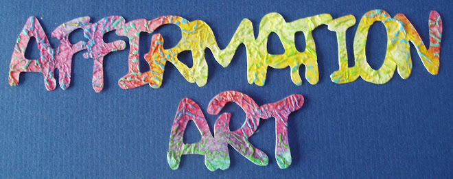
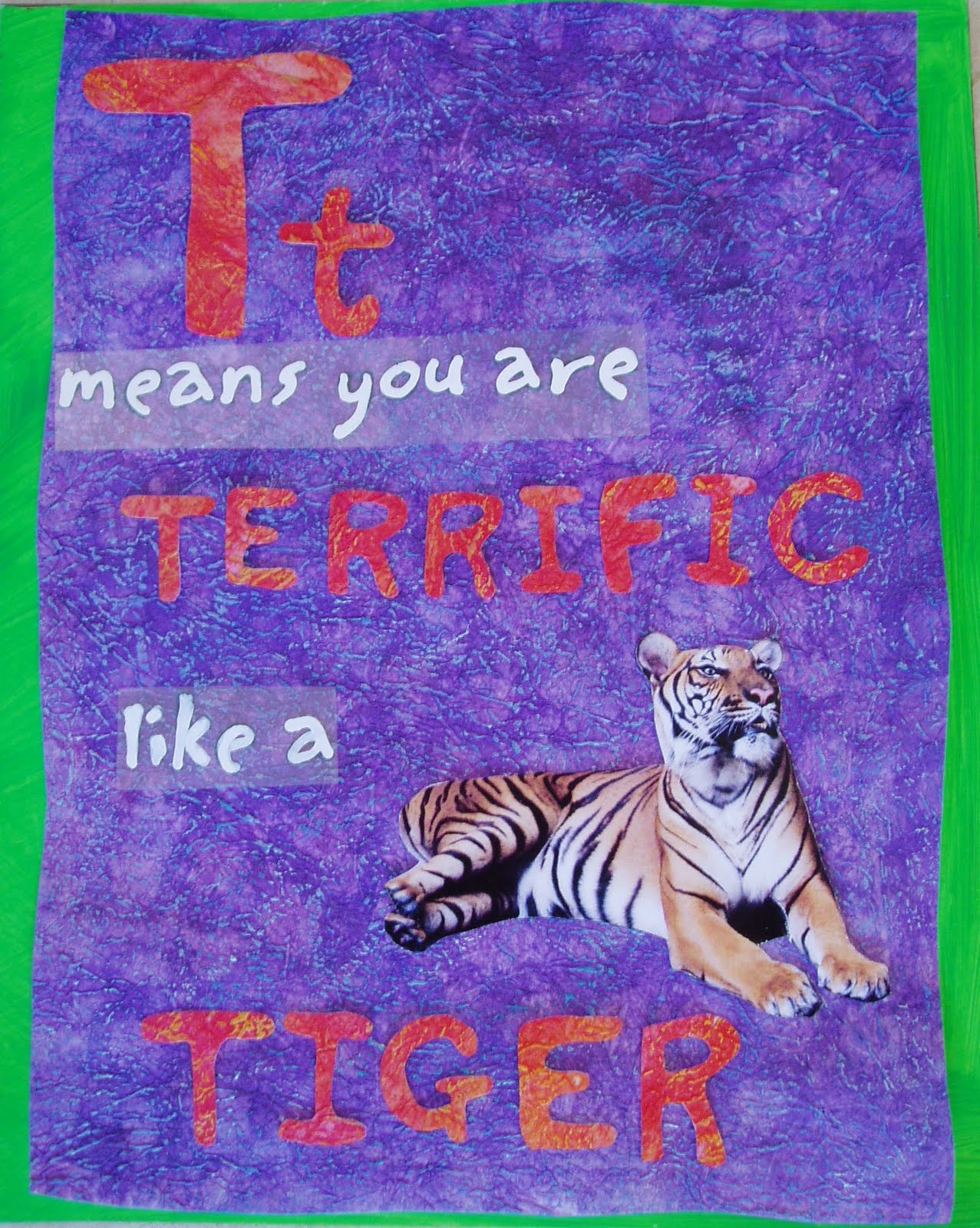
Paint Party Friday I have really got a move on in the last couple of days so I have something to put up. Below are the next two for the ABC. I discovered last weekend that the images I was looking to use for the animals were all going to cost a fortune so then I did more research and found a great site. It's called
morguefile and has lots and lots of FREE photographs. The Rhino and Tiger are from there.
Does any one have a picture of their cat doing something clever that I can use? I have spent the week trawling through photographs and getting my paper prepped ready for painting and pastelling and today scrambled together these two. Learning lots as I go about sizing etc!
Now dear friends I really want some feed back. Is the lettering OK, does it matter that it's a bit all over the place and not a standard neat font? Does it matter that some words are in different sizes? (FYI the white means you are and like a is on plastic so I can move them around. They will eventually be stuck down with out plastic around them.) Nothing is stuck down yet so there is still room for improvement. The feedback I have had so far for the first two is good, but I am still not sure. I'm concerned that each page too similar to each other to keep adult and child interest for 26 pages. A whole book. What do you think?
And now, to something completely different. I have, for me BIG news. I have decided to go to LA to attend
Byron Katie's School for the work in October. I am signed up and have bought my tickets so it looks like a go. I will also go and visit my brother and his family in North Carolina while I am in that part of the world. It's a big thing for me to sign up for. Lots of money being spent!! And I am sure worth it. I have done lots and lots of personal growth things over the years and The Work and the four questions are the best I have found yet. And, It's given me a deadline. I want the book done by the time I go. A few more days of prep, then it's
just putting it all together!


I'm not seeing what you are describing with reference to the text being all over the place. Not sure how you are creating these. They are very sweet. Have fun on your trip to L.A. Sounds like an interesting thing you are embarking on. Please fill us in. Happy PPF!
ReplyDeleteI love your pages, the text looks good! Enjoy your trip to LA! Valerie
ReplyDeleteCats are too clever to get their picture taken when they are being remarkable!
ReplyDeleteThese pieces are fun. Text is fine. It makes it more interesting to be in different sizes, but I've been taught that less is more. So, don't use more than two fonts. Not sure if that's necessarily true for all pieces but it does make sense generally.
I love your ABC's and the lettering is perfect. Playful! :) Lucky you for going to LA. :)
ReplyDeleteFun pieces Rosie! I'd forgotten about morguefile...thx for the reminder. Enjoy LA - How Exciting for you and Happy PPF!
ReplyDeleteI think these look great - i like the font you used, just the way they are! They are very clever!
ReplyDeleteI think these are wonderful and I like your font! Really cute! :-)
ReplyDeleteBeautiful work..I think they look terrfiic!
ReplyDeleteEnjoy BK!
Victoria
Great work and letters should be different sizes ~ very creative ~ namaste ~Carol (Share the Creative Journey) Happy PPF
ReplyDeleteI think the age you seem to be aiming for is all about familiarity and repetition.
ReplyDeleteSure the adult will want to light their hair on fire after the hundredth reading, but that's part of it, right? Can't we all still recite our kid's favorite ABC book years later?
Smashing collages Rosie. Happy PPF, Annette x
ReplyDeleteCongrats on the classes!
ReplyDeleteI think that the letters look great as they are.
An alphabet book is going to be similar throughout (I've read a LOT of alphabet books, being a children's librarian for years and years). If you're worried about it, you might want to make one or two pages different than the others. Maybe for the unusual (hard to find words for) letters. Like having the page for U be upside down. But, really, you don't have to. Children like familiarity and the simplicity helps them as they're learning the alphabet (which is what an alphabet book is supposed to be about!).
Happy PPF!
Your alphabet is progressing beautifully. I like the whimsical look of the lettering not all being the same size, but agree that you should stick with only a couple fonts styles so that it remains consistent! Great advise from Anne too! Fun Stuff...enjoy your creative journey! POP ART MINIS
ReplyDeleteTHANK you all for your feedback. Because I have hand created the font there isn't really a consistent 'style' to it. That's what I mean by being all over the place. So, another question, does it look like many different fonts or just one?!
ReplyDeleteI like your creativeness. Looking at the rhino reminded me of when I had business cards with a rhino on them. I had my r/e license in an office called Rhino Realty. It brought back memories. I think you work is great. Thanks for sharing.
ReplyDeleteWow - thanks SO much for the idea of adding texture to my painting. I can't wait to try it! As for your lettering, I'm thinking it looks good - it's reminiscent of a child's writing but clear and simple. Kids should love it!
ReplyDeleteThese are wonderful and I think the lettering looks great, very fun and whimsical!!! Sounds like a cool site for photos, I'll check it out, thanks!Have fun in LA on your adventure!!! Deb
ReplyDeleteThis is a fun and playful project and I think your text reflects that :)
ReplyDeleteThank you for the link to the photo sharing site... very good to know!
xo
Kristin
I like your pages. I think they are different enough to hold anyone's attention for the 26 letters. Great work.
ReplyDeleteFaye
More fun alphabet pages! Have a great trip!
ReplyDeleteI had a friend do Byron Katie's class a couple of years ago and she uses the questions all the time, I'm sure you are going to get so much out of the course! And on scootering, I was scared to death the first time I was on the scooter, but as I had already purchased it I had to learn. It's great motivation! Happy PPF!
ReplyDeleteThese are very fun pages. Is there anyway to add a touch of shading around the esdges of these letters to make them have more dimension off the page? That's the only thing that stands out for me, otherwise they are great!
ReplyDeleteI think your lettering has a stylized, cohesive look to it. I love that you use both upper case and lower case lettering - it mirrors the uppercase and lowercase "featured letter" on each page. At first I thought that varying the placement of the text from page to page would be a good idea, but since this is a book for pre-readers, having the text following a predictable visual pattern is a great way to build literacy skills. If the large text at the bottom of the page is always the name of the animal, they will start to associate that combination of letters with the picture/name of the animal. and in addition to all that, your pages are alive with energy and your backgrounds are gorgeous.
ReplyDeleteI think you did a great job, everything looks good to me! Enjoy your trip!
ReplyDeleteLooking forward to your stories about the classes.
ReplyDeleteCute and fun alphabet.
to me it all looks like the same font, very cute!
ReplyDeleteAdorable!!! I love these! Sorry, I can't help you with the cat photo - the cat that lives in my backyard doesn't do anything remarkable, only stupid things... but she's adorable while doing it!
ReplyDeleteI like the fonts/text like they are. I think it makes it more interesting & playful not to have everything too uniform.
ReplyDeleteI shall have to look up Byron Katie's link with your recommendation. Sounds great to be travelling and investing in a course important to you.
Kat :-)
I think they look great!!! Letting can be what ever you want it to be?
ReplyDeleteI am so excited for you that you are going to see Byron Katie!!! You lucky girl! I have her books and I have some itune works that she has done. Good for you!!! Have fun and do the work.